Lost rough edges
The drugstore chain dm has given its organic products a new packaging design. So far, the concept has only been presented on social networks such as Instagram. There was also criticism.
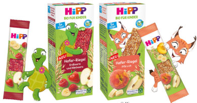
The assortment for the organic drinks of the drugstore chain dm has been visibly changed. The new green organic logo immediately catches the customer’s eye: it is now round instead of angular. The overall appearance is more playful – among other things through small illustrations and finer lettering. Gradually, the food packaging of the company’s own organic brand is also to be changed. In addition, dm is now putting more information on the packaging: the consumer learns that the oat drink with soy is „ideal for frothing“. More detailed recipe ideas, background stories and information about the product can also be found on the packaging. Storytelling is the concept behind it: brands must evoke emotions in order to score points at the point of sale. Purchase decisions for beverages are made at the POS.
However, Dm is one of those companies and brands that also present themselves strongly on the Internet. For example, the drugstore chain presented the new design in the social network Instagram and invited customers to engage in dialogue with it. However, numerous comments by dm followers also show that customers would have liked more sustainability instead of more chic design. The company should rather check the range for superfluous plastic packaging, several users write.


